Acts of Color
storytelling through art and design.
Acts of Color explores the intersection of visual art and theatrical design through the lens of a working freelance artist. Each post invites readers behind the scenes of the creative process—where sketches become stories and color becomes character. From discussions on set, lighting, and costume design to reflections on freelance artistry, collaboration, and creative growth, this blog celebrates the artistry that connects the stage and the studio. Whether you’re an artist, designer, or simply someone who finds inspiration in storytelling through image and atmosphere, Acts of Color offers a thoughtful look at how design shapes emotion, narrative, and experience.
Between Stillness and Movement
My work is grounded in a desire to capture moments that exist between stillness and movement — the transient beauty of a landscape, the authenticity of a candid figure, or the quiet curiosity of an animal. Each piece holds space for emotion and presence, translating the subtle narratives of daily life into visual form. My art reflects a personal journey of healing and transformation, conveying calm, reflection, and connection — qualities that parallel my aspiration to guide others in art therapy as they explore and process their own experiences through creative expression.
I work primarily in gouache and pastel, drawn to their capacity to balance vividness with subtlety. Gouache provides a luminous depth, while pastel adds velvety softness, allowing me to convey both vibrancy and warmth. The interplay of these materials creates an atmosphere that feels both alive and intimate. My process begins intuitively, sketching loosely in color to capture the emotional essence of a moment before refining composition and detail.
Painting has become a meditative practice that bridges observation and emotion. Natural light, atmospheric landscapes, and the human capacity for resilience inspire me. My work often explores balance — between realism and abstraction, order and chaos, fragility and strength. Each piece becomes an act of quiet reflection and gratitude.
As both an artist and aspiring art therapist, I strive to help others access the same healing potential that art has offered me. My goal is to work with middle and high school students navigating trauma, identity, relationship challenges, and emotional setbacks. I believe creative expression gives individuals a language beyond words — a means to reimagine their stories, externalize pain, and discover clarity and empowerment through the creative process.


Journey to Becoming a Freelance Artist
It all begins with an idea.
Finding Freedom at the Confluence: Where Rivers Meet
Being a freelance artist means embracing both freedom and challenge. After years of working as a theatre teacher, where schedules and contracts often dictated my day, I now get to choose where, when, and how I create. One of my favorite moments of this journey brought me to Harpers Ferry, West Virginia, to capture a place that has always filled me with peace and inspiration: the meeting of the Shenandoah and Potomac Rivers.
The Scene That Inspired Me
Where Rivers Meet is a 9x12 plein air painting on Bristol Board, created with Winsor & Newton gouache under layers of pastel and Prisma colored pencil. Ink and gel pen add extra texture and contrast. When I arrived, I searched for a view framed naturally by trees and mountains. Benches and railings were present, but I wanted to remove the barriers of the modern world—to let the river feel as free as it does when I imagine dipping my toes in its cool water.
Painting in Plein Air: Challenges and Joys
Painting outdoors with gouache is always a delicate dance. The paint dries quickly, so I continually added water to maintain the soft “melted ice cream” consistency I needed. Working in sections helped me preserve the layered details in rocks, leaves, and flowing water. Each brushstroke required patience, focus, and a love for the subtle interplay of color, light, and texture.
Moments with the Public
One of my favorite parts of painting in public is the chance encounters with people. A young boy once watched me intently from a bench until his parents encouraged him to come closer—he was fascinated by color mixing and how the paint moved on the paper. Later, an art collector stopped to chat, sharing his own love of Harpers Ferry and the river’s paths. These interactions remind me that art is both personal and communal—a way to connect, share stories, and inspire curiosity.
Sharing a Piece of My Heart
I hope Where Rivers Meet offers a glimpse into the quiet energy of this historic site and the joy I find in translating it onto paper. May it invite you to step past barriers, feel the river’s gentle flow, and take a moment to pause in the beauty of nature.

Title: Where Rivers Meet
Medium: Gouache under pastel and colored pencil
Description:
Where Rivers Meet captures the serene confluence of the Shenandoah and Potomac Rivers in Harpers Ferry, West Virginia. Layers of gouache, pastel, and colored pencil convey the contrast between dark slate mountains and vibrant summer greens. The river’s gentle current winds gracefully around scattered rocks, revealing nature’s quiet strength and enduring beauty.
Harvest Hues & Pumpkin Views: Exploring Autumn’s Color Magic
Ever feel the colors of autumn reach out to you? That’s the magic of color theory, like a field of ripe pumpkins ready to inspire! Here’s a playful harvest of ideas for cultivating harmony in your next creative adventure.
Step into a vibrant pumpkin patch where Sunfire Hues and Moonlight Shades dance across the fields. 🍁🎃 From ruby reds and tangerine oranges to sapphire blues and amethyst purples, this season’s palette is playful, abundant, and full of harvest magic. Join me as we gather inspiration from the colors of fall and learn to mix, match, and celebrate your own seasonal palette. 🌾✨

Title: Harvest Haul
Medium: Watercolor and ink on 140 lb. cold press watercolor paper
Dimensions: 9 x 12 inches
Description:
Step into the heart of autumn with Harvest Haul! In the foreground, an old Ford pickup overflows with pumpkins in every shade from royal purple to glowing orange, ready for a harvest festival. Just behind, a quirky, stylish scarecrow keeps a cheerful watch over the patch, as if inviting the pumpkins—and you—into its whimsical world. Beyond them, a forest stretches under a playful blue sky, dotted with puffy white clouds that seem to dance above the scene. Painted in watercolor with ink accents, this piece celebrates abundance, warmth, and the joyful spirit of fall, where every pumpkin, cloud, and leaf feels full of personality.
Have you ever felt a room whisper secrets to you? That’s the magic of color theory weaving its spell! Here’s a playful potion for conjuring color harmony in your next creative adventure:
☀️ Sunfire vs. Moonlight 🌙
Sunfire Hues: ruby reds, tangerine oranges, golden yellows—like pumpkins glowing in the morning sun! 🎃✨
Moonlight Shades: sapphire blues, emerald greens, amethyst purples—like twilight settling over cornfields and misty harvest evenings. 🌌🍂
✨ Star-Crossed Complements
Pair colors on opposite ends of the wheel (cerulean & coral, violet & tangerine) for a cosmic pop! Think of them like bright pumpkins against a crisp autumn sky—small bursts that steal the show. 🍁
🎨 Neighborhood Harmony
Invite three “best-friends-on-the-wheel” (reds → oranges → golds, or blues → purples → pinks) for a cozy gradient cuddle—like the layered warmth of fall leaves or a patchwork of autumn fields. 🍁🏘️ Perfect for spaces that feel like a welcoming harvest hug.
🔺 Triad Treasure Hunt
Pick three equally spaced gems (sunshine yellow, ocean blue, cherry red) and scatter them like falling leaves across your work for balance, energy, and joyful whimsy. 🍂🍃
🧪 Harvest Mood Elixirs
🍒 Cherry Red: sparks passion and appetite for life
🌊 Ocean Blue: calms the soul and sharpens focus
🌲 Forest Green: grows peace, renewal, and stability
🍋 Lemon Zest: brightens with creativity and optimism
🍊 Tangerine Orange: radiates warmth, energy, and autumn cheer
💜 Amethyst Purple: inspires imagination and cozy reflection
Which duo or trio of harvest magic is calling to you—onstage, in a gallery, or curled up in your pumpkin patch nook?
Builder of Worlds
Quick Tips for Building Immersive Worlds
1. Immerse Yourself in Inspiration
Dive into theatrical or literary worlds and bring those experiences into the tactile space. Textures, colors, and small details make the environment feel alive.
2. Stick to a Theme and Color Scheme
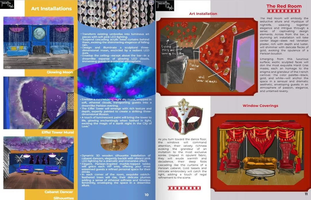
Red Room: Moulin Rouge-inspired reds, velvet blacks, and gold accents create passion and intimacy.
Blue Room: Paris-at-night blues, muted purples, and pops of pink evoke romance and dreamy escapism.
3. Consider Light as a Character
Think of lighting as a storytelling tool. Cloud-shaped ceiling tiles with LEDs in blue, purple, and pink create dynamic mood shifts and highlight textures.
4. Use Accent Colors with Purpose
Accents guide the eye and balance the space: gold in the Red Room, pink in the Blue Room. Contrasts and complements make the environment feel cohesive and magical.
Building Worlds Onstage & Off: Lessons from a Moulin Rouge-Inspired Club
If you’ve ever dreamed of stepping into another world—one that feels alive, vibrant, and entirely immersive—you’re in good company. Creating a space that transports people, whether onstage or in a real-world environment, is about more than just decoration; it’s about storytelling, mood, and sensory experience. Here’s a glimpse into some lessons I’ve learned while crafting a Moulin Rouge-inspired world, designed to enchant and delight at every turn.
(The image above shows both the Red Room and Blue Room designs, giving a glimpse of how color, theme, and light work together.)
Immerse Yourself in Inspiration
To build a world that feels authentic, start by fully immersing yourself in theatrical or literary realms. Explore the stories, characters, and aesthetics that ignite your imagination. Then, think about how those ideas can translate into the tactile world: the feel of velvet under your fingertips, the shimmer of sequins catching the light, or the curve of a hand-painted flourish on a wall. Immersion fuels creativity, and the more you’ve “lived” in other worlds, the richer your design will be.
Stick to a Theme and Color Scheme
A cohesive world gives people both comfort and intrigue. In this project, the Red Room bursts with the passion and energy of classic Moulin Rouge reds, deep purples, and gold accents, evoking drama and intimacy. The Blue Room, themed as Paris at night, uses deep blues, muted purples, and pops of pink to create a dreamy, romantic escape. Keeping each room true to its own palette and theme allows visitors to feel fully transported while maintaining a narrative thread across the space.
Consider Light as a Character
Lighting is not just illumination—it’s a storytelling element. In the Blue Room, cloud-shaped ceiling tiles house LEDs that shift between blue, purple, and pink, adding dynamic movement and mood that interacts with the color palette. Thoughtful lighting highlights textures, enhances depth, and transforms surfaces, making the space feel alive and ever-changing.
Use Accent Colors with Purpose
Accent colors are your secret weapon. In this design, gold accents in the Red Room add warmth and sparkle, while pink accents in the Blue Room bring playful contrast and charm. Carefully chosen accents guide the eye, balance the space, and create visual focal points that feel intentional and cohesive.
Building immersive worlds is about curiosity, attention to detail, and playful experimentation. Whether you’re designing a club, a theatre set, or any creative environment, these principles help you transport your audience to a space that feels alive, magical, and unforgettable.